Monday 13 April 2015

Note To Moderator

To the examiner,


I do hope you enjoy reading through and looking at the posts on my blog with all the work that I have completed over the past couple of months on it. The posts that I have done have all been clearly labelled and they can be seen in the blog archive and they are also labelled on the right hand side of the blog. I have enjoyed completing the tasks on my AS Media course and have put a lot of work and effect into carrying out research and also making my final magazine.
Thank-you very much,
Melissa :)

Saturday 14 March 2015

Preliminary Activity


The two pictures above are pieces of work that I have done using Photoshop to make a school magazine. I took the images myself and selected these three from 24 different photos. I chose the cover page image because ‘Cam’ had eye contact with the camera and also the way he is standing made it easier to layout my text and headings.

I chose the font because I thought it was easy to read and also bold for the audience to see. I drew the colour of the heading font out from the badge on ‘Cam’s football shirt to keep within the colour scheme of my page. The colour scheme that I chose to do for this preliminary activity is white, navy and blue. This stereotypically makes the magazine look more male directed however my target audience would be anyone between the age of 16 and 18.

Evaluation Question 1 Final


Evaluation Question 2 Final


Evaluation Question 3 Final


Evaluation Question 4 Final


Evaluation Question 5 Final

Evaluation Question 6 Final


Evaluation Question 7 Final


Development/Stages of Double Page Spread


Development/Stages of Contents Page


https://flic.kr/s/aHsk6JXGp3

Development/Stages Cover Page


Evaluation Question 1 Draft


  1. In what ways does your media product use, develop or challenge forms and conventions of real media products?

 The masthead of my magazine ‘CONFIDE’, was done using the font ‘impact’ which was already on the Photoshop software and is also available on other sources like Microsoft word. The font itself is quite tall and bold therefore stands out to the audience and will grasp the reader’s attention. This convention is similar to the majority of other magazines as they all want to get an audience’s attention just from looks on top of the content. The reason why I chose the title ‘CONFIDE’ was firstly so it was easy to remember. On top of this the definition of ‘confide’ is: ‘tell someone about a secret or private matter while trusting them not to repeat it to others’. I feel that this makes my magazine seem more private and exclusive therefore the audience will presume that the magazine is also exclusive to only them with more private and exclusive content about the musical artists that they like. I felt when I decided on this name that it would make my audience feel important and that they could relate more to the chart artists as the content in some cases was a lot more personal. Furthermore my target audience would most probably have secrets about themselves and friends therefore having the title ‘Confide’ meaning secrets could match the identity of my target audience. My masthead and title font in my opinion would be quite similar to other magazines in the market, like COSMOPOLITAN and BLISS magazine. I think this because they are also very bold titled magazines that stand out on the cover of the magazine. My ‘CONFIDE’ masthead is layered behind my central main image but on top of the background and this makes my model look more eye catching however it also relates back to the definition of Confide itself, secrets and hiding things from another and the masthead is theoretically ‘hiding’ behind the main image. I tried to make my magazine quite full so that my target audience saw straight away that it would be full of content.


The graphology of and on my front cover for my magazine is quite busy compared to some other magazines as for one, I have used a few different fonts including, ‘impact’, ‘candara’ and others. These fonts were used for my masthead and then also my surrounding text informing the audience of the content within the magazine. The fonts that I chose to use are quite simplistic and this means that they will easy for my target audience to read and also so that they are bold and eye catching. The colours that I have used for all the text are also quite bold as they are, ‘black’, ‘blue’ and ‘white’. These colours complement each other when on top of each other and also pink which I have also included on my cover (no text written in pink). These colours were chosen also as they went well with ‘HUMAN’s’ logo which is white and pink and they are also the main feature of this particular magazine. The reason why I chose to use black for the masthead is so that it is clear and bold when layered on top of the grey/white background. My masthead needs to be bold and eye catching as it needs to gain the attention of my target audience, potential customers and it will also help to promote my magazine. I used a white text layered on a black background below the masthead and this makes this piece of text ‘exclusive access’ stand out to the audience further as it doesn’t match the title too much. However below this I have also used black text for the price, issue number and month of the issue. I have made this piece of text black and chose to put it on the grey background next to the barcode as this is important information that doesn’t need to stand out the page but does need to be readable as its information that the audience would need to know on purchasing the product. For example, they would need to know the cost of the magazine straight away. Also on the cover I have included information about what is going to be featured inside the magazine. These pieces of texts are highly important factors of a/my magazine cover page as it is what will initially gain the customers attention and engage them into buying my product but it also informs them about what artists are going to be in it. This means that this information is important to stand out and this is why I have chosen bold colours to use for my colour scheme and I have layered the colours on top of each other so that they are easy to read. For a lot of my text I have put a shape like a box behind the text so that the text is easier to read rather than putting it straight on to the main cover image. The majority of the text on the front would be the main features of my magazine therefore it is important that they stand out the most.


The black colour being used is one of the most powerful and prominent colours on the page however I feel the most powerful colour overall on my cover page would be the blue and pink as they add impact to specific features of the cover that will grasp the attention of the audience and further potential customers. The choice of the size of the text was generally down to the importance of what was being said and was to be noticed first. For example; having the text about HUMAN in a bold circle makes it more visible to the audience and this means they will pick up on this being the main feature. Having the larger text, like the masthead, as the more important features helps will branding and labelling my magazine or product. Furthermore, it is the cover lines which express the main topics and content of my magazine therefore it is important to engage the audience’s attention through graphology related features on the cover e.g. text size. The cover layout was slightly influenced by the BLISS magazine layout and this is because of the fullness of the page engaging the audience’s attention. However on my magazine I have rotated my barcode 90 degrees and made it smaller as on BLISS magazine the barcode is actually on a larger scale. My barcode is just below the masthead of my magazine and I chose to put it there so that my target audience wouldn’t be faffing about looking for it before purchasing the product. I also chose my barcode to be quite skinny so that it didn’t take up too much space on the cover page that could be used for the content. I kept developing my idea to get this final result because previously I had put in a larger barcode but I then had audience feedback and felt that it stood out slightly too much therefore I reduced the size. The overall layout of my magazine is again similar to the cover of BLISS magazine but also COSMOPOLITAN magazine and this is due to some of the similar conventions like the large bold masthead and also the mass of the content on the cover page itself. I decided that I should keep my magazine cover busy as I felt this is what my target audience would be looking for and they would want a lot going on, on the cover page. As a result I felt that this has met the needs and interests of my particular target audience.


My model and musical artist ‘Charlie Dickins’ (cover girl) was styled in two different dark coloured outfits in the photo shoot for my magazine and this is so that the colours didn’t clash with the content surrounding the image. ‘Charlie Dickins’ is my cover girl but she is also part of the band ‘HUMAN’ which is the featured band on my double page spread. On these pages you can only see her wearing two different outfits however they are of similar colour. Her first outfit is a grey bodycon dress with black panels down both sides and her second outfit is black jeans and black crop top with a high neck line. This made my model stand out when next to all the text as if she was wearing colourful clothing her outfit may have been less noticeable next to the vibrant content and colours. Her clothes are the type of thing you would find in a high street shop that is very popular therefore as an audience that would be interested in fashion and having their own look they could relate to the models style. This style also relates to artists you may see in other magazines like BLISS or COSMOPOLITAN. My model is styled to look around the age of 18 or 19 and this is so that she is of an age of who would be setting an example and being a role model to the younger female target audience. I am using conventions from real magazines and products to make my artist look as realistic and as suitable for my magazine genre which is pop/chart. I have found that my model does look suitable for my magazine and this is easily seen throughout my cover, contents and double page spread. Continuing through my magazine I kept my two main models (HUMAN band) in similar dark colours of black and grey. Having these two colours for my models meant that I could easily have different bolder colours around them as you can see on my double page spread.

Evaluation Question 2 Draft

2. How does your media product represent particular social groups?


During my research and planning before starting to produce my media product, I looked at different audiences, created audience profiles and made artist profiles. I found that this was an important feature of my magazine as I had to make sure that the features of my magazine attracted my target audience which were younger girls who were interested in chart and pop music and the social group around this genre. Having my genre as this I know what social group I need to talk towards and it also has given me a clear idea of what type of audience will be buying my music magazine. I carried out some research into a social group using UK Tribes and also a personal survey given to those I would stereotype as my audience for my magazine. UK Tribes is a website that has lots of different categories about youth groups and what they would fit into. There is a lot of variation also on the website so I looked under the name ‘Mainstream’ which had further information about things like ‘fangirls’. This label was suitable to my magazine as it was also an example of a target audience that I had described. Fangirl’s are a type of audience that fit into the social group of who my magazine is marketed towards. This label also goes alongside nicely with my genre of pop/chart. After reviewing this research that I found on the website I found that fangirls and this tribe and social group are an entry level, heavily female-biased Tribe who are passionately devoted to pop icons and twitter’ and this means firstly relates to my target audience but also my idea of relating my media product to a website also. This website could then have relations with twitter. The research into fangirls and pop culture also suggests that the fangirl tribe ‘has grown exponentially in strength, size and influence thanks to social media – especially Twitter. Thanks to the internet and ‘always on’ celebrity culture, young Fan Girls can now follow their idols’ every move from their bedroom – in the company of thousands of other Fan Girls online.’ This encourages me further to use well-known artists but to also create new bands and artists to further extend the fangirl social group to a wider audience.


From the research I did I also feel that my magazine needed to feature some kind of male ‘attraction’ as stereotypical fangirls go for bands and male groups? This also meant including new musicians that have variation and don’t stick to one particular genre. Furthermore my magazine would also need to include some kind of link to another area of media, so perhaps a website of which my audience can read further articles and research more into these new artists etc. However mainstream and chart/pop involve some quite popular musical artists therefore I would have to keep some of these involved to gain a social groups attention. On top of this to keep on the same level as my target audience and make sure that my media product represents the needs of the social group so I made the decision to dress my models/artists in similar clothing as my audience members. This would be so that there was some similarity and relation between the artists and the audience. I chose my artist ‘HUMAN’ who is a new girl duo/band who dress in black and grey clothes but look very glamorous. This style could easily be copied and duplicated for the audience and target social groups. This all represents the social group which I have researched and found information about. My artists are around the age of 18-19 and my target audience of around 14-20 year olds so I feel this is a good age to platform my artists. I am comparing my upcoming artist ‘HUMAN’ to two members of the band ‘Little Mix’. These are a well-known, pop music, girl band that have quite a large fan based of fangirls and chart followers. I have represented my artist ‘HUMAN’ in the mainstream social group as Little Mix would also fit into this area of UK Tribes and this social group. This is by the way I have styled the girls. This represents my audience (social group) as its not indie or alternation and this means that it isn’t following this particular crowd of people. The clothes that the girls are wearing in the images would be similar to the clothes you could get hold of in high street shops and this represents some of the clothing shops that some of my target audience would go to and by similar clothes from. Styling my artist like the girls from Little Mix will certainly help gain customers and a further audience to my product as it will engage with the interests they already have. I have also represented my social group within my article and with other images of my artist within my media product as some of the images of ‘HUMAN’ are quite natural and fun and this would be how the ‘fangirl’ audience would like it. On top of this I have also spoke briefly about their tour and their musical career and this means that it is relatively similar to what would be written in magazine with an article about Little Mix in it.

Evaluation Question 3 Draft

3. What kind of media institution might distribute your media product and why?

Publishing is the process of which production and distribution of something like, music, literature, and other information go through before it reaches their audience. There is lots of different distribution and publishing companies that are all within the media industry and these companies include: Bauer Publishing, Time Inc., Meredith and a variety of others. One other publishing company includes IPC Media, which is an international publishing company. This company is one of the UK’s leading and most successful digital and magazine publishing companies and it also has a large reputation of selling over a million copies of their different magazines in just a year. The company also own 60 of the more well-known brands. On top of this IPC owns many magazines and their brands like NME. NME is a very successful magazine known for its musical knowledge and articles. Furthermore it also owns a magazine called NUTS which is a well-known men’s leisure magazine and a women’s weekly magazine called NOW which is also very successful.

The money used for the production and the publishing of my magazine, CONFIDE, would all be funded from different adverts and promotion of products from other companies. An example of advertisement that would be included in my magazine, includes, tour advertising and perhaps merchandise for a particular artist. To get the finances I would charge the companies a sum of money for a certain amount of space in my magazine and this would be to ensure that I can afford the production and publishing but also that they can promote their products to a wider audience. This would be a benefit to these companies because it means that they will be being advertised to a larger audience and perhaps a different type of audience that may develop an interest in the product due to it being in my magazine. A reason why it would be benefitting my magazine would be because it will be helping to fund my magazine and make it more successful. The overall inspiration to use advertisement and promotion was to then gain the attention of production companies and their funding by large ranges of other magazine producers such as, ID magazine and Dazed magazine.

Overall I feel that IPC Media is the appropriate and suitable institution to publish my ‘CONFIDE’ magazine as it has a large range of experience within publishing and distribution of many successful and categorised magazines. Also, it has the experience and knowledge of publishing female targeted magazines like ‘Look’. Look magazine is for quite young people therefore the register of the articles would be suitable and similar to that of my magazine. This will be a benefit to my magazine production as IPC’s producers can be a support to my magazine and inspire me with designing and developing my magazine further. An example of this is that they could make recommendations of where to distribute my magazine to my audience and what customers will have the largest in my magazine. It is important to have the correct media institution to help promote my media magazine so that it is successful.


Evaluation Question 4 Draft

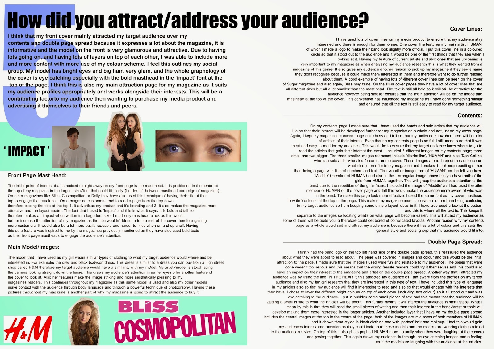
4. Who would be the audience for your media product?

From the research that I did for my target audience of fangirls/chart and pop followers, I came to the conclusion that my music magazines audience would be exclusively targeted towards females in the age bracket of 14 - 20. I feel that this age range is an appropriate one to target at as this is when my audience will be the most interested in lots of different types of music therefore the charts and pop industry would be suitable to this crowd of people. Fangirls can be found in all sorts of genres of music therefore having and pop/chart magazine would reach a further audience than just limiting it to an indie/alternative audience.  I have also based my target audience on the liveliness and bubbliness of the content and the colour scheme of which I will use.  I have looked at research and have noticed that when it comes to gigs and concerts, people who are under 18 sometimes have to attend with an adult therefore I would need to have artists within my magazine that would be appropriate for 18+ people who would want to attend but also families in some ways as those 14 year olds that read my magazine would have to take perhaps a parent. Therefore I would have to have artists appropriate for everyone to read about and enjoy yet still fall into the social category of my target market. I have chosen the age of 20 as the stop point for my target audience as this is when people will be in university and may lose interest in magazines and pop music. On top of this, people may start to settle down and have less colourful lifestyles and this could have an impact on their musical interests.

The sales to the different ages could have different results each month and this could be due to the artists that I feature in my magazine. An example being that; bands like One Direction could attract the younger ages of my target market whereas Clean Bandit might be more towards the older groups. This would have an effect on the sales. The genre of my magazine and the music within it is pop/chart music and this means that my magazine will focus on groups of fans together and how they support a particular artist rather than their differences between each other. I would presume my audience to have similar fashion sense to each other also and act towards music in similar ways rather than having contradicting opinions like the audience of an indie/alternation magazine. I feel that there is a gap in the market for a magazine of my genre for this age group as BLISS magazine, the magazine I used for research, has been disbanded and no longer runs therefore my magazine would be popular alternative for this audience. On top of this I feel that a lot of the magazines that are out there at the minute are quite alternative/indie. From this I am now aware that for my own magazine I need to offer a bigger range of artists that are known and unknown and also information about these artists within my magazine but still keep it at a reasonable price. The price that I have put on my magazine is £3.99 and I feel this is an appropriate price for my magazine as it isn’t too expensive for my audience.

When designing and producing my magazine I had to make sure that I kept all my research in mind and make sure that my magazine fits the style and genre that I chose for my target audience. This would be to ensure that my audience are interested in my magazine­­ and also that the artists that I have created ‘HUMAN’ is appropriate in clothing styles for my genre and audience. The hair styles of my artists are quite glamourous rather than being messy or unusual and this is a popular style for this genre of magazine. It is similar to other pop artists like Selena Gomez who styles her hair has quite big and wavy. I also styled and designed my magazine so that it was bold and full so that there is lots’ going on for my audience to see. On top of this it also matches the genre more appropriately.

Below are two audience profiles, which I feel are the type of girls who would read this style and genre of magazine. They have similar style to my artists and they also fit in well with my target audience research meaning they could be potential customers of ‘CONFIDE’ magazine. On top of this I also asked the two girls a few questions about my magazine which could soon go onto the magazine market. These questions could include questions like; ‘would you be willing to buy this magazine if it was to go onto the pop/chart magazine market?’, ‘how much would you pay for this magazine?’ and finally ‘what artists would you like to read about in a music magazine?’


Name: Olivia Moore

Age: 16

Interests: Dancing, listening to music

Favourite Clothes Shop: H and M

Favourite Artist: Rhianna

Currently Read: There isn’t really a music magazine that I’m interested in at the minute so I just read fashion magazines…

Question 1: Would you be willing to buy this magazine if it was to go onto the pop/chart magazine market? Yes definitely because like I said there aren’t really any pop ones for my age group at the minute.

Question 2: How much would you pay for this magazine? I don’t know, it depends really, I think up to £4.50

Question 3: What artists would you like to read about in a music magazine? Well Rhianna if I’m honest but I quite like the idea of having new artists to read about.

 
Name: Amy Fowles

Age: 19

Interests: Love dancing and singing and all things like that

Favourite Clothes Shop: Newlook, River Island etc

Favourite Artist: I like most music that’s in the charts. Like Ed Sheeran though

Currently Read: I read a lot of online articles on buzzfeed

Question 1: Would you be willing to buy this magazine if it was to go onto the pop/chart magazine market? Yeah sure, looks really cool and interesting to me

Question 2: How much would you pay for this magazine? Well, I don’t have a job at the minute so only perhaps £3 - £4…

Question 3: What artists would you like to read about in a music magazine? Anyone who quite well known and in the charts and stuff.